


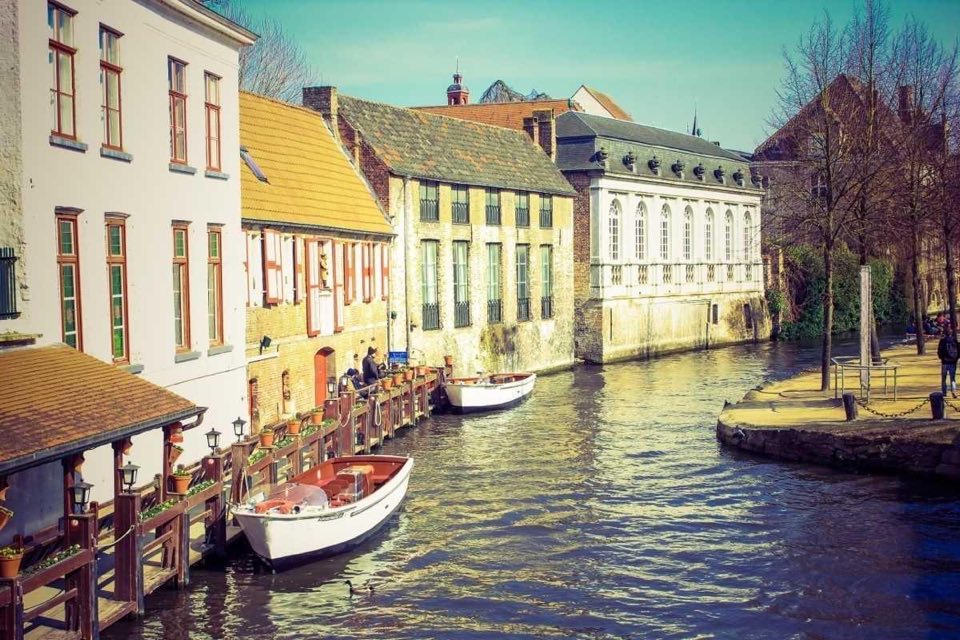

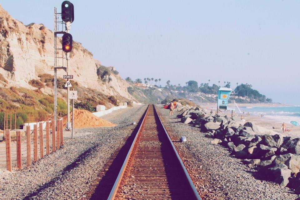
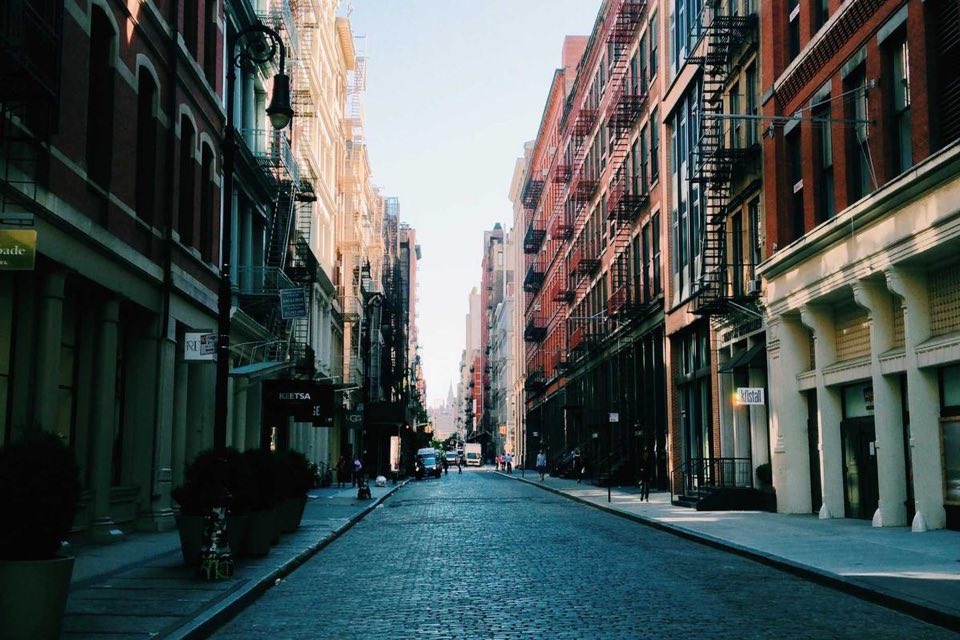
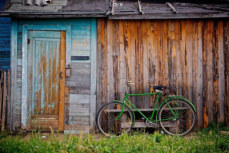
CarouselDemo
'use client'

import { Button } from '@/components/ui/button'
import { Carousel, CarouselItem, CarouselItemLabel } from '@/components/ui/carousel'

const photos = ['Mountains', 'Waterfall', 'Santorini', 'Canals', 'Sunset', 'Coastline', 'Streets', 'Cabin']

export function CarouselDemo() {
    return (
        <div className='flex w-full max-w-xl flex-col'>
            <Carousel>
                {photos.map(photo => (
                    <CarouselItem key={photo} onClick={() => {}}>
                        {/* eslint-disable-next-line @next/next/no-img-element */}
                        <img src={`/carousel/${photo.toLowerCase()}.jpg`} alt={photo} className='size-full object-cover' />
                        <CarouselItemLabel className='text-white [text-shadow:0_1px_4px_rgb(0_0_0/0.6)]'>{photo}</CarouselItemLabel>
                    </CarouselItem>
                ))}
            </Carousel>
            <Button variant='text' size='sm' className='mr-2 self-end'>
                Show all
            </Button>
        </div>
    )
}
Installation
- Copy and paste the following code into your project
src/components/ui/carousel.tsx
'use client'

import * as React from 'react'
import { useCallback, useContext, useEffect, useLayoutEffect, useRef } from 'react'

import { cn } from '@/lib/utils'

type CarouselLayout = 'multi-browse' | 'hero' | 'center-hero' | 'uncontained' | 'full-screen'

interface Arrangement {
    // Item sizes of the focal keyline state, in slot order
    keylines: number[]
    large: number
    small: number
    // Index of the first large slot
    focal: number
    largeCount: number
}

interface CarouselContextValue {
    layout: CarouselLayout
    itemWidth: number
    register: (index: number, node: HTMLDivElement | null) => void
    focusItem: (index: number) => void
}

const CarouselContext = React.createContext<CarouselContextValue | null>(null)
const CarouselIndexContext = React.createContext(0)

const DEFAULT_ITEM_WIDTH: Record<CarouselLayout, number> = {
    'multi-browse': 200,
    hero: 360,
    'center-hero': 360,
    uncontained: 240,
    'full-screen': 0,
}

// Leading and trailing container padding; full-screen carousels are edge-to-edge
const PADDING = 16
const SMALL_MIN = 40
const SMALL_MAX = 56

const lerp = (a: number, b: number, t: number) => a + (b - a) * t
const clamp = (value: number, min: number, max: number) => Math.min(max, Math.max(min, value))

// Finds the slot counts whose large item is closest to the preferred size, similar to M3's lowest cost arrangement.
function findArrangement(
    layout: CarouselLayout,
    extent: number,
    preferred: number,
    gap: number,
    count: number,
): Arrangement {
    const single: Arrangement = {
        keylines: [extent],
        large: extent,
        small: layout === 'full-screen' ? 0 : SMALL_MIN,
        focal: 0,
        largeCount: 1,
    }
    if (layout === 'full-screen' || count <= 1 || extent <= 0) return single

    const mediumCounts = layout === 'multi-browse' ? [1, 0] : [0]
    const smallCount = layout === 'center-hero' ? 2 : 1
    const maxLarge = Math.max(1, Math.ceil(extent / Math.max(preferred, 1)) + 1)

    let best: { cost: number; arrangement: Arrangement } | null = null

    for (const mediumCount of mediumCounts) {
        for (let largeCount = 1; largeCount <= maxLarge; largeCount++) {
            const slots = largeCount + mediumCount + smallCount
            if (slots > count) continue

            const available = extent - gap * (slots - 1)
            // Medium items sit halfway between large and small: available = L * a + S * b
            const a = largeCount + mediumCount / 2
            const b = smallCount + mediumCount / 2
            const small = clamp((available - preferred * a) / b, SMALL_MIN, SMALL_MAX)
            const large = (available - small * b) / a
            if (large < SMALL_MAX * 1.5) continue

            const medium = (large + small) / 2
            const keylines =
                layout === 'center-hero'
                    ? [small, ...Array(largeCount).fill(large), small]
                    : [...Array(largeCount).fill(large), ...Array(mediumCount).fill(medium), small]

            // Prefer layouts that keep a medium item, as multi-browse asks for one
            const cost = Math.abs(large - preferred) + (layout === 'multi-browse' && mediumCount === 0 ? preferred : 0)
            if (!best || cost < best.cost) {
                best = {
                    cost,
                    arrangement: { keylines, large, small, focal: layout === 'center-hero' ? 1 : 0, largeCount },
                }
            }
        }
    }

    return best?.arrangement ?? single
}

// Keyline states the carousel passes through: the focal state, then end shifts that let the last items grow large.
// Center-aligned heroes keep their layout at both ends.
function buildStates({ keylines, focal, largeCount }: Arrangement, shift: boolean) {
    const m = keylines.length
    const after = shift ? m - focal - largeCount : 0

    const ends: number[][] = [keylines]
    for (let j = 1; j <= after; j++) {
        ends.push([...keylines.slice(m - j).reverse(), ...keylines.slice(0, m - j)])
    }

    return { ends, after }
}

function slotStarts(sizes: number[], gap: number, offset: number) {
    const starts: number[] = []
    for (const size of sizes) {
        starts.push(offset)
        offset += size + gap
    }
    return starts
}

function interpolateState(states: number[][], progress: number) {
    const index = Math.min(Math.floor(progress), states.length - 1)
    const next = states[Math.min(index + 1, states.length - 1)]
    const f = progress - index
    return states[index].map((size, i) => lerp(size, next[i], f))
}

function Carousel({
    layout = 'multi-browse',
    itemWidth,
    className,
    style,
    children,
    onKeyDown,
    ...props
}: React.ComponentProps<'div'> & {
    layout?: CarouselLayout
    itemWidth?: number
}) {
    const scrollerRef = useRef<HTMLDivElement>(null)
    const viewportRef = useRef<HTMLDivElement>(null)
    const trackRef = useRef<HTMLDivElement>(null)
    const itemsRef = useRef<(HTMLDivElement | null)[]>([])
    const metricsRef = useRef<{
        arrangement: Arrangement
        states: ReturnType<typeof buildStates>
        pitch: number
        steps: number
        extent: number
        padding: number
    } | null>(null)

    const items = React.Children.toArray(children)
    const count = items.length
    const keyline = layout !== 'uncontained'
    // Full-screen carousels scroll vertically; uncontained ones scroll freely without snapping
    const vertical = layout === 'full-screen'
    const preferred = itemWidth ?? DEFAULT_ITEM_WIDTH[layout]
    const spacing = vertical ? 16 : 8
    const shouldSnap = layout !== 'uncontained'

    const register = useCallback((index: number, node: HTMLDivElement | null) => {
        itemsRef.current[index] = node
    }, [])

    const update = useCallback(() => {
        const scroller = scrollerRef.current
        const metrics = metricsRef.current
        if (!scroller || !metrics) return

        const { arrangement, states, pitch, steps, extent, padding } = metrics
        const { keylines, large, small } = arrangement
        const m = keylines.length
        const g = clamp((vertical ? scroller.scrollTop : scroller.scrollLeft) / pitch, 0, steps)
        const placements = new Map<number, { start: number; size: number }>()

        if (g >= steps - states.after) {
            const sizes = interpolateState(states.ends, g - (steps - states.after))
            slotStarts(sizes, spacing, padding).forEach((start, i) =>
                placements.set(count - m + i, { start, size: sizes[i] }),
            )
        } else {
            // Items travel between keylines. Virtual small slots sit just past the container edges, so items
            // leaving or entering bleed over the padding.
            const first = Math.floor(g)
            const sizes = [small, ...keylines, small]
            const starts = [-small - spacing, ...slotStarts(keylines, spacing, padding), extent + spacing]
            for (let i = Math.max(0, first - 1); i <= Math.min(count - 1, first + m); i++) {
                const p = i - g + 1
                if (p <= 0 || p >= sizes.length - 1) continue
                const j = Math.floor(p)
                const f = p - j
                placements.set(i, { start: lerp(starts[j], starts[j + 1], f), size: lerp(sizes[j], sizes[j + 1], f) })
            }
        }

        // Labels stay visible down to the medium size, then fade toward small
        const medium = (large + small) / 2
        const firstPlaced = Math.min(...placements.keys())
        itemsRef.current.forEach((node, i) => {
            if (!node) return
            // Off-screen items stay focusable just outside the clipped viewport
            const placement = placements.get(i) ?? {
                start: i < firstPlaced ? -small - spacing : extent + spacing,
                size: small,
            }
            node.style.visibility = 'visible'
            node.style.transform = vertical ? `translateY(${placement.start}px)` : `translateX(${placement.start}px)`
            node.style[vertical ? 'height' : 'width'] = `${placement.size}px`
            node.style.setProperty('--carousel-item-size', `${placement.size}px`)
            node.style.setProperty('--carousel-item-offset', `${(large - placement.size) / 2}px`)
            node.style.setProperty(
                '--carousel-item-progress',
                `${medium > small ? clamp((placement.size - small) / (medium - small), 0, 1) : 1}`,
            )
            node.dataset.size =
                placement.size >= large - 0.5 ? 'large' : placement.size <= small + 0.5 ? 'small' : 'medium'
        })
    }, [count, spacing, vertical])

    const measure = useCallback(() => {
        const scroller = scrollerRef.current
        if (!scroller || !keyline) return

        const extent = vertical ? scroller.clientHeight : scroller.clientWidth
        const padding = layout === 'full-screen' ? 0 : PADDING
        const arrangement = findArrangement(layout, extent - padding * 2, preferred, spacing, count)
        const states = buildStates(arrangement, layout !== 'center-hero')
        const pitch = arrangement.large + spacing
        const steps = Math.max(0, count - arrangement.keylines.length + states.after)

        metricsRef.current = { arrangement, states, pitch, steps, extent, padding }
        scroller.style.setProperty('--carousel-large-size', `${arrangement.large}px`)

        const viewport = viewportRef.current
        if (viewport) viewport.style[vertical ? 'height' : 'width'] = `${extent}px`
        const track = trackRef.current
        if (track) {
            track.style[vertical ? 'height' : 'width'] = `${extent + steps * pitch}px`
            track.querySelectorAll<HTMLElement>('[data-slot=carousel-snap]').forEach((node, i) => {
                node.style.display = i <= steps ? '' : 'none'
                node.style[vertical ? 'top' : 'left'] = `${i * pitch}px`
            })
        }
        update()
    }, [count, keyline, layout, preferred, spacing, update, vertical])

    useLayoutEffect(() => {
        measure()
        const scroller = scrollerRef.current
        if (!scroller || !keyline) return
        const observer = new ResizeObserver(measure)
        observer.observe(scroller)
        return () => observer.disconnect()
    }, [keyline, measure])

    // Scroll events already fire once per frame, so update in place to avoid a frame of lag
    const handleScroll = () => {
        if (keyline) update()
    }

    const scrollToStep = useCallback(
        (step: number) => {
            const scroller = scrollerRef.current
            const metrics = metricsRef.current
            if (!scroller || !metrics) return
            const clamped = clamp(step, 0, metrics.steps)
            scroller.scrollTo({ [vertical ? 'top' : 'left']: clamped * metrics.pitch, behavior: 'smooth' })
        },
        [vertical],
    )

    // Maps vertical mouse wheel scrolling onto horizontal carousels as smooth, continuous scrolling. Snapping is paused
    // while the wheel moves and resumes on the nearest item once it settles, matching native horizontal scrolling.
    useEffect(() => {
        const scroller = scrollerRef.current
        if (!scroller || vertical) return
        let position = 0
        let target: number | null = null
        let frame = 0
        let settleTimer = 0
        let settling = false

        const snapPoints = () => {
            const metrics = metricsRef.current
            if (keyline && metrics) return Array.from({ length: metrics.steps + 1 }, (_, i) => i * metrics.pitch)
            const padding = parseFloat(getComputedStyle(scroller).scrollPaddingLeft) || 0
            return itemsRef.current.filter(Boolean).map(node => node!.offsetLeft - padding)
        }

        const animate = () => {
            if (target === null) {
                frame = 0
                return
            }
            const diff = target - position
            if (Math.abs(diff) < 0.5) {
                position = target
                scroller.scrollLeft = position
                frame = 0
                if (settling) {
                    settling = false
                    target = null
                    scroller.style.scrollSnapType = ''
                }
                return
            }
            position += diff * 0.25
            scroller.scrollLeft = position
            frame = requestAnimationFrame(animate)
        }

        const run = () => {
            if (!frame) frame = requestAnimationFrame(animate)
        }

        const settle = () => {
            // Without snapping, let the current animation finish and release the target there
            if (!shouldSnap) {
                settling = true
                run()
                return
            }
            const max = scroller.scrollWidth - scroller.clientWidth
            const from = target ?? scroller.scrollLeft
            const points = snapPoints()
            if (!points.length) {
                target = null
                scroller.style.scrollSnapType = ''
                return
            }
            const nearest = points.reduce((best, point) => (Math.abs(point - from) < Math.abs(best - from) ? point : best))
            settling = true
            target = clamp(nearest, 0, max)
            run()
        }

        const handleWheel = (event: WheelEvent) => {
            if (event.ctrlKey || Math.abs(event.deltaY) <= Math.abs(event.deltaX)) return
            const delta = event.deltaMode === 1 ? event.deltaY * 16 : event.deltaY
            const max = scroller.scrollWidth - scroller.clientWidth
            const base = target ?? scroller.scrollLeft
            // Hand off to the page at either end
            if ((delta < 0 && base <= 0) || (delta > 0 && base >= max - 0.5)) return
            event.preventDefault()

            if (target === null) position = scroller.scrollLeft
            settling = false
            scroller.style.scrollSnapType = 'none'
            target = clamp(base + delta, 0, max)
            run()

            clearTimeout(settleTimer)
            settleTimer = window.setTimeout(settle, 160)
        }

        scroller.addEventListener('wheel', handleWheel, { passive: false })
        return () => {
            scroller.removeEventListener('wheel', handleWheel)
            cancelAnimationFrame(frame)
            clearTimeout(settleTimer)
            scroller.style.scrollSnapType = ''
        }
    }, [keyline, shouldSnap, vertical])

    // Brings an item onto the first large keyline
    const focusItem = useCallback(
        (index: number) => {
            const metrics = metricsRef.current
            if (!keyline) {
                itemsRef.current[index]?.scrollIntoView({ block: 'nearest', inline: 'nearest', behavior: 'smooth' })
                return
            }
            if (metrics) scrollToStep(index - metrics.arrangement.focal)
        },
        [keyline, scrollToStep],
    )

    const handleKeyDown = (event: React.KeyboardEvent<HTMLDivElement>) => {
        onKeyDown?.(event)
        if (event.defaultPrevented) return
        const prev = vertical ? 'ArrowUp' : 'ArrowLeft'
        const next = vertical ? 'ArrowDown' : 'ArrowRight'
        if (event.key !== prev && event.key !== next) return

        const scroller = scrollerRef.current
        if (!scroller) return
        event.preventDefault()
        const direction = event.key === next ? 1 : -1
        const metrics = metricsRef.current
        if (keyline && metrics) {
            const current = Math.round((vertical ? scroller.scrollTop : scroller.scrollLeft) / metrics.pitch)
            scrollToStep(current + direction)
        } else {
            const distance = 0.8 * (vertical ? scroller.clientHeight : scroller.clientWidth)
            scroller.scrollBy({ [vertical ? 'top' : 'left']: distance * direction, behavior: 'smooth' })
        }
    }

    const content = items.map((child, i) => (
        <CarouselIndexContext.Provider key={i} value={i}>
            {child}
        </CarouselIndexContext.Provider>
    ))

    return (
        <CarouselContext.Provider value={{ layout, itemWidth: preferred, register, focusItem }}>
            <div
                ref={scrollerRef}
                role='region'
                aria-roledescription='carousel'
                tabIndex={0}
                data-slot='carousel'
                data-layout={layout}
                data-orientation={vertical ? 'vertical' : 'horizontal'}
                className={cn(
                    'relative flex overscroll-contain outline-none [scrollbar-width:none]! focus-visible:outline-2 focus-visible:outline-offset-2 focus-visible:outline-primary [&::-webkit-scrollbar]:hidden!',
                    vertical ? 'h-120 flex-col overflow-y-auto' : 'w-full overflow-x-auto',
                    shouldSnap && (vertical ? 'snap-y snap-mandatory' : 'snap-x snap-mandatory'),
                    // Uncontained items flow natively with leading padding only
                    !keyline && 'gap-2 py-2 pl-4 scroll-pl-4',
                    !vertical && (layout === 'uncontained' ? 'h-50' : 'h-55'),
                    className,
                )}
                style={style}
                onScroll={handleScroll}
                onKeyDown={handleKeyDown}
                {...props}
            >
                {keyline ? (
                    <div ref={trackRef} className={cn('relative shrink-0', vertical ? 'w-full' : 'h-full')}>
                        <div
                            ref={viewportRef}
                            className={cn('sticky overflow-clip', vertical ? 'top-0 w-full' : 'left-0 h-full')}
                        >
                            {content}
                        </div>
                        {Array.from({ length: count + 1 }, (_, i) => (
                            <div
                                key={i}
                                aria-hidden
                                data-slot='carousel-snap'
                                className={cn(
                                    'pointer-events-none absolute snap-start',
                                    vertical ? 'inset-x-0 h-px' : 'inset-y-0 w-px',
                                )}
                            />
                        ))}
                    </div>
                ) : (
                    content
                )}
            </div>
        </CarouselContext.Provider>
    )
}

function CarouselItem({
    className,
    width,
    children,
    onClick,
    onFocus,
    onKeyDown,
    style,
    ...props
}: React.ComponentProps<'div'> & { width?: number }) {
    const context = useContext(CarouselContext)
    const index = useContext(CarouselIndexContext)
    if (!context) throw new Error('CarouselItem must be used within Carousel')

    const { layout, itemWidth, register, focusItem } = context
    const keyline = layout !== 'uncontained'
    const vertical = layout === 'full-screen'
    const interactive = !!onClick

    const ref = useCallback((node: HTMLDivElement | null) => register(index, node), [index, register])

    const handleFocus = (event: React.FocusEvent<HTMLDivElement>) => {
        onFocus?.(event)
        if ((event.target as HTMLElement).matches(':focus-visible')) focusItem(index)
    }

    const handleKeyDown = (event: React.KeyboardEvent<HTMLDivElement>) => {
        onKeyDown?.(event)
        if (interactive && (event.key === 'Enter' || event.key === ' ') && event.target === event.currentTarget) {
            event.preventDefault()
            event.currentTarget.click()
        }
    }

    // Keyline items sit 8dp from the cross-axis edges, except edge-to-edge full-screen items
    const inset = vertical ? 'inset-x-0' : 'inset-y-2'

    return (
        <div
            ref={ref}
            role={interactive ? 'button' : 'group'}
            aria-roledescription={interactive ? undefined : 'slide'}
            tabIndex={interactive ? 0 : undefined}
            data-slot='carousel-item'
            className={cn(
                'group/carousel-item overflow-hidden rounded-[28px] bg-surface-container-highest outline-none focus-visible:outline-2 focus-visible:-outline-offset-2 focus-visible:outline-primary',
                keyline ? cn('invisible absolute top-0 left-0', inset) : 'relative shrink-0 snap-start',
                interactive && 'cursor-pointer',
                className,
            )}
            style={keyline ? style : { width: width ?? itemWidth, ...style }}
            onClick={onClick}
            onFocus={handleFocus}
            onKeyDown={handleKeyDown}
            {...props}
        >
            {/* Content keeps the large item size and stays centered, so shrinking items mask it with a parallax effect */}
            <div
                data-slot='carousel-item-content'
                className={cn(
                    'absolute',
                    keyline
                        ? vertical
                            ? 'inset-x-0 top-1/2 h-(--carousel-large-size) -translate-y-1/2'
                            : 'inset-y-0 left-1/2 w-(--carousel-large-size) -translate-x-1/2'
                        : 'inset-0',
                )}
            >
                {children}
            </div>
            {interactive && (
                <div
                    data-slot='carousel-item-layer'
                    className='pointer-events-none absolute inset-0 rounded-[inherit] transition-colors group-hover/carousel-item:bg-on-surface/8 group-active/carousel-item:bg-on-surface/10'
                />
            )}
        </div>
    )
}

// Labels follow the visible part of their item and fade out as it collapses toward the small size
function CarouselItemLabel({ className, style, ...props }: React.ComponentProps<'div'>) {
    const context = useContext(CarouselContext)
    const vertical = context?.layout === 'full-screen'

    return (
        <div
            data-slot='carousel-item-label'
            className={cn('absolute line-clamp-2 p-4 text-base font-medium', vertical ? 'inset-x-0' : 'bottom-0', className)}
            style={{
                opacity: 'var(--carousel-item-progress, 1)',
                ...(vertical
                    ? { bottom: 'var(--carousel-item-offset, 0px)' }
                    : { left: 'var(--carousel-item-offset, 0px)', width: 'var(--carousel-item-size, 100%)' }),
                ...style,
            }}
            {...props}
        />
    )
}

export { Carousel, CarouselItem, CarouselItemLabel }
Usage
import { Carousel, CarouselItem, CarouselItemLabel } from '@/components/ui/carousel'<Carousel>
<CarouselItem>
<img src='/photo.jpg' alt='' className='size-full object-cover' />
<CarouselItemLabel className='text-white'>Mountains</CarouselItemLabel>
</CarouselItem>
...
</Carousel>Items are masks with 28px corners and 8px gaps, inset 16px from the leading and trailing edges and 8px from the top and bottom. Their content keeps the large item's size and stays centered, so it is cropped rather than squeezed as the item shrinks, and items scrolling off bleed over the padding. CarouselItemLabel follows the visible part of its item, stays on large and medium items, and fades out on small ones. It inherits the text color, so add text-white over photos. Pass onClick to CarouselItem to make it interactive with hover and pressed state layers.
The carousel scrolls natively and snaps to items, except in the uncontained layout. A vertical mouse wheel scrolls horizontal carousels as smoothly as horizontal scrolling, snaps to the nearest item when it stops, and hands off to the page at either end. With keyboard focus, arrow keys move between items, and tabbing to an interactive item brings it into the large position.
On vertically scrolling pages, add a way to view every item without scrolling sideways, such as a Show all button below the carousel.
Hero
hero keeps one or more large items in focus, followed by a small item.
CarouselHeroDemo
import { Carousel, CarouselItem, CarouselItemLabel } from '@/components/ui/carousel'

const photos = ['Mountains', 'Waterfall', 'Santorini', 'Canals', 'Sunset', 'Coastline', 'Streets', 'Cabin']

export function CarouselHeroDemo() {
    return (
        <div className='w-full max-w-xl'>
            <Carousel layout='hero'>
                {photos.map(photo => (
                    <CarouselItem key={photo}>
                        {/* eslint-disable-next-line @next/next/no-img-element */}
                        <img src={`/carousel/${photo.toLowerCase()}.jpg`} alt={photo} className='size-full object-cover' />
                        <CarouselItemLabel className='text-white [text-shadow:0_1px_4px_rgb(0_0_0/0.6)]'>{photo}</CarouselItemLabel>
                    </CarouselItem>
                ))}
            </Carousel>
        </div>
    )
}
Center-aligned hero
center-hero centers the large item between two small items and keeps this layout at both ends.
CarouselCenterHeroDemo
import { Carousel, CarouselItem, CarouselItemLabel } from '@/components/ui/carousel'

const photos = ['Mountains', 'Waterfall', 'Santorini', 'Canals', 'Sunset', 'Coastline', 'Streets', 'Cabin']

export function CarouselCenterHeroDemo() {
    return (
        <div className='w-full max-w-xl'>
            <Carousel layout='center-hero'>
                {photos.map(photo => (
                    <CarouselItem key={photo}>
                        {/* eslint-disable-next-line @next/next/no-img-element */}
                        <img src={`/carousel/${photo.toLowerCase()}.jpg`} alt={photo} className='size-full object-cover' />
                        <CarouselItemLabel className='text-white [text-shadow:0_1px_4px_rgb(0_0_0/0.6)]'>{photo}</CarouselItemLabel>
                    </CarouselItem>
                ))}
            </Carousel>
        </div>
    )
}
Uncontained
uncontained keeps every item at itemWidth and lets items flow off the edge, with leading padding only. It scrolls freely without snapping.
CarouselUncontainedDemo
import { Carousel, CarouselItem, CarouselItemLabel } from '@/components/ui/carousel'

const photos = ['Mountains', 'Waterfall', 'Santorini', 'Canals', 'Sunset', 'Coastline', 'Streets', 'Cabin']

export function CarouselUncontainedDemo() {
    return (
        <div className='w-full max-w-xl'>
            <Carousel layout='uncontained' itemWidth={180}>
                {photos.map(photo => (
                    <CarouselItem key={photo}>
                        {/* eslint-disable-next-line @next/next/no-img-element */}
                        <img src={`/carousel/${photo.toLowerCase()}.jpg`} alt={photo} className='size-full object-cover' />
                        <CarouselItemLabel className='text-white [text-shadow:0_1px_4px_rgb(0_0_0/0.6)]'>{photo}</CarouselItemLabel>
                    </CarouselItem>
                ))}
            </Carousel>
        </div>
    )
}
Multi-aspect ratio
Set width on each CarouselItem in an uncontained carousel to mix item widths, from 9:16 up to 16:9.
CarouselMultiAspectDemo
import { Carousel, CarouselItem, CarouselItemLabel } from '@/components/ui/carousel'

// Widths range from 9:16 to 16:9 for a 184px tall item
const photos = [
    { label: 'Mountains', width: 327 },
    { label: 'Waterfall', width: 104 },
    { label: 'Santorini', width: 184 },
    { label: 'Canals', width: 138 },
    { label: 'Sunset', width: 327 },
    { label: 'Coastline', width: 184 },
    { label: 'Streets', width: 245 },
    { label: 'Cabin', width: 104 },
]

export function CarouselMultiAspectDemo() {
    return (
        <div className='w-full max-w-xl'>
            <Carousel layout='uncontained'>
                {photos.map(({ label, width }) => (
                    <CarouselItem key={label} width={width}>
                        {/* eslint-disable-next-line @next/next/no-img-element */}
                        <img src={`/carousel/${label.toLowerCase()}.jpg`} alt={label} className='size-full object-cover' />
                        <CarouselItemLabel className='text-white [text-shadow:0_1px_4px_rgb(0_0_0/0.6)]'>{label}</CarouselItemLabel>
                    </CarouselItem>
                ))}
            </Carousel>
        </div>
    )
}
Full screen
full-screen shows one edge-to-edge item at a time with 16px between items, scrolling vertically. It works best for portrait content.
CarouselFullScreenDemo
import { Carousel, CarouselItem, CarouselItemLabel } from '@/components/ui/carousel'

const photos = ['Mountains', 'Waterfall', 'Santorini', 'Canals', 'Sunset', 'Coastline', 'Streets', 'Cabin']

export function CarouselFullScreenDemo() {
    return (
        <div className='w-full max-w-xs'>
            <Carousel layout='full-screen'>
                {photos.map(photo => (
                    <CarouselItem key={photo}>
                        {/* eslint-disable-next-line @next/next/no-img-element */}
                        <img src={`/carousel/${photo.toLowerCase()}.jpg`} alt={photo} className='size-full object-cover' />
                        <CarouselItemLabel className='text-white [text-shadow:0_1px_4px_rgb(0_0_0/0.6)]'>{photo}</CarouselItemLabel>
                    </CarouselItem>
                ))}
            </Carousel>
        </div>
    )
}
Sizing
In multi-browse, hero, and center-hero, the carousel measures itself and picks how many large, medium, and small items fit, keeping the large width close to itemWidth. Small items stay between 40px and 56px. Set the carousel height with className.
API Reference
Carousel
| Prop | Type | Default |
|---|---|---|
| layout | multi-browse | hero | center-hero | uncontained | full-screen | multi-browse |
| itemWidth | number (max large item width, or item width when uncontained, in px) | depends on layout |
| className | string |
All other div props are forwarded to the scroll container.
CarouselItem
| Prop | Type | Default |
|---|---|---|
| width | number (uncontained only) | itemWidth |
| onClick | React.MouseEventHandler | |
| className | string |
Keyline items expose data-size (large, medium, or small) and the --carousel-item-size, --carousel-item-offset, and --carousel-item-progress CSS variables for custom transitions.
CarouselItemLabel
Accepts all div props.